

The Science of Service: How Uniform Color Strategy Drives Profit and Performance
Your staffs clothes impact their mindset. See why color psychology and textile engineering are vital for operational excellence and luxury branding.
Content
Executive Summary
In the contemporary hospitality landscape, the uniform is no longer a mere commodity of standardization; it is a sophisticated instrument of environmental psychology, brand architecture, and operational performance. As the primary visual interface between the hotel’s ethos and the guest’s experience, the strategic application of color in staff apparel serves a dual function: it shapes the guest’s perception of value while influencing the employee’s efficiency through the phenomenon of enclothed cognition.
This analysis moves beyond basic color theory to explore textile engineering, psychometric impacts, and emerging 2025 trends—such as “Dopamine Dressing” and “Mocha Mousse” palettes—that are redefining the visual language of service. By dissecting the requirements of specific roles, we illustrate how a scientifically calibrated uniform program drives brand equity and operational excellence.

1. Introduction: The Evolution of the Hospitality Uniform
1.1 From Livery to Brand Beacon
Historically, the hospitality uniform traces its lineage to the “livery” of the 18th and 19th centuries—garments designed strictly to denote rank within a household hierarchy. As noted in recent academic analyses of hotel uniform trends, these early iterations were functional markers of social stratification, often devoid of ergonomic consideration or psychological nuance.
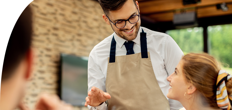
However, the modern era has witnessed a paradigm shift. Today, the uniform is a “wearable brand,” a mobile architectural element that extends the hotel’s interior design into the human dimension. For the strategic operator, this necessitates a transition from mass production to specific customization. A concierge’s blazer is not just clothing; it is a tool of authority. A housekeeper’s tunic is not just a cover-all; it is an instrument of dignity.
1.2 The Manufacturer’s Role in Psychometrics
The responsibility of the uniform manufacturer has expanded to include the role of a behavioral consultant. When a client requests a “blue” uniform, our task at RON Group is to interrogate that request through the lens of psychology and physics. Is it a “trust” blue for a receptionist handling credit cards? Or a “utilitarian” blue for an engineer?
Furthermore, we must ensure the fidelity of that color. The psychology of a color fails if the manufacturing execution is flawed. If a “luxury black” fades to a “fatigued grey” after thirty industrial washes, the psychological signal shifts from “elegance” to “neglect.” This intersection of psychology and durability is the cornerstone of our manufacturing philosophy.
2. The Physics and Chemistry of Color in Textiles
Before understanding the psychological impact of color, one must appreciate the technical complexity of achieving and maintaining that color in a commercial environment. The “Lab Dip” and “Pantone Matching” processes are the unsung heroes of uniform consistency.
2.1 The Lab Dip Process: Precision Engineering
A “Lab Dip” is the initial prototype of a color dyed onto a specific fabric swatch. As detailed in manufacturing guides regarding lab dips in the garment industry, this is the critical checkpoint where brand vision meets chemical reality.
The Metamerism Challenge: One of the greatest challenges in hospitality uniform design is metamerism—where two colors match under one light source but differ under another. A hotel environment is complex; a front desk agent moves from a tungsten-lit lobby to natural daylight.
Manufacturer’s Protocol: We review Lab Dips in “light boxes” that simulate the specific lighting conditions of the client’s property. This attention to detail is similar to the rigor required when sourcing restaurant furniture from China, where material consistency is paramount.
2.2 Textile Composition and Color Absorption
The psychology of a color is deeply affected by the substrate (fabric) on which it sits.
Natural Fibers (Cotton/Wool): These fibers absorb dye deeply, resulting in rich, matte colors. This texture communicates warmth and organic luxury, much like the aesthetic goals discussed in our guide on furnishing Italian restaurants.
Synthetic Fibers (Polyester/Nylon): Because the fiber is essentially plastic, the color sits on the surface and reflects more light. Without matte finishes, a polyester “rust” apron can appear synthetic, potentially signaling “fast food” rather than “farm-to-table.”
The “Heathering” Effect: To mitigate the flatness of solid colors, we often employ “heathered” fabrics. This adds visual depth, which is perceived as higher quality and hides minor stains better than flat solids—a crucial factor for employee efficiency.
2.3 Dye Technologies and Longevity
For a uniform to maintain its psychological impact, it must be colorfast.
Reactive Dyes: Used for cellulosics (cotton), these form a covalent bond with the fiber. They are essential for F&B uniforms that undergo hot washing to remove food soils.
Vat Dyes: The gold standard for chlorine fastness. For pool attendants or housekeeping staff using bleach-based cleaners, vat dyes are non-negotiable to prevent the “bleach splash” effect that destroys visual integrity.
3. The Psychological Spectrum: Neuroaesthetics in Design
The application of color in hospitality is governed by two distinct psychological mechanisms: External Perception (how the guest views the staff) and Internal Enclothed Cognition (how the staff views themselves).
3.1 Enclothed Cognition: The Internal Audience
Research in enclothed cognition demonstrates that the symbolic meaning of clothing changes the wearer’s psychological state.
Role Transition: The act of changing into a uniform creates a boundary between the “personal self” and the “professional self.”
The Competence Loop: When an employee wears a garment that aligns with the archetype of their role, their confidence increases. White papers on the impact of company uniforms suggest that staff turnover can be reduced when employees feel a sense of pride and competence in their appearance.
3.2 Guest Perception: The External Audience
Guests make judgments about competence, hygiene, and safety within seconds. Color is the primary data point in this assessment. For example, recent insights into staff attire and customer perception indicate that specific color choices directly influence a guest’s trust in the hygiene standards of an establishment.
3.3 The Color Code: A Technical Breakdown
| Color Family | Psychological Impact (Guest) | Best Applications | Manufacturing Considerations |
|---|---|---|---|
| Blue (Navy/Midnight) | Trust, Stability. Lowers heart rate; signals financial security. | Front Desk, Management, Finance. | Requires high-quality disperse dyes to prevent UV degradation (“reddening”). |
| Black / Charcoal | Sophistication. Creates a formal distance; implies premium service. | Fine Dining, Night Concierge, Security. | Must be a “true black.” Faded black signals neglect. |
| White | Purity, Hygiene. The ultimate signal of cleanliness standards. | Chefs, Spa Therapists. | Requires stain-release technology (Teflon/Nanotex) to remain viable. |
| Earth Tones (Mocha) | Warmth, Approachability. Signals “home” and organic luxury. | Lifestyle Hotels, Baristas. | “Mocha Mousse” is a trending neutral replacing corporate greys. |
4. Departmental Analysis: The Hierarchy of Hue
A hotel is a city within a building. Each department requires a unique color strategy that balances the Internal need for efficiency with the External need for branding.
4.1 Front of House: The Ambassadors
The Objective: To bridge the gap between authority and hospitality.
Concierge: We often utilize deep Navy or Charcoal to mimic the business suit. However, in 2025, we are seeing a shift towards Textured Greys and Tweeds in lifestyle hotels to appear more “curated” and less corporate.
Valet: High contrast is key. We integrate retro-reflective piping that appears grey in daylight but reflects white at night, satisfying safety requirements without forcing staff to wear industrial Hi-Vis vests that degrade the luxury image.
4.2 Food & Beverage: The Sensory Experience
The Objective: To stimulate appetite, hide soils, and facilitate rapid movement.
Fine Dining: While the “invisible service” model often relies on black, the 2025 trend is moving toward Chocolate Brown (Mocha) and warm neutrals to soften the experience.
Efficiency: Just as you would calculate when your restaurant tables start making money, you must calculate the ROI of your uniforms. Dark aprons (Burgundy, Navy, Brown) are essential for camouflaging spills, allowing servers to maintain confidence throughout a shift.
4.3 Housekeeping: The Dignity of Design
The Objective: To provide comfort and dignity while signaling impeccable hygiene.
The Shift: Historically, housekeepers wore invisible greys. Modern psychology dictates Teal, Lavender, or Cool Grey tunics. As highlighted in evaluations of hotel staff uniforms, comfort and mobility are critical for staff retention in these physically demanding roles.
The “Clean” Paradox: We recommend color-blocked tunics—a darker base to hide stains on the torso, with lighter trim near the face to signal freshness.
4.4 Spa & Wellness: The Biological Response
The Objective: To trigger a parasympathetic nervous system response (relaxation).
Color Strategy: We strictly avoid black in spas, as high contrast stimulates alertness. Instead, we use Bamboo, Sage, and Soft Lilac.
2025 Trend: Moving away from “Clinical White” toward Warm Earth Tones like Terracotta, grounding the guest in nature.
4.5 Engineering & Back of House
The Objective: Safety compliance without abandoning brand identity.
Color Strategy: Dark Navy or Spruce Green are most effective at masking grease and dust.
Branding: We customize workwear by dyeing industrial-grade fabrics in the hotel’s specific brand navy, ensuring that if an engineer walks through the lobby, they look like a professional part of the team.

5. Design Strategy for 2025: Emerging Trends
As we approach 2025, the uniform industry is witnessing a “Chromatic Renaissance.” The austerity of the post-2010s is giving way to expressiveness.
5.1 Dopamine Dressing
The concept of Dopamine Dressing—wearing colors to induce joy—is infiltrating hospitality. Industry observers note that dopamine dressing is becoming a major fashion philosophy, and this applies to resorts as well. A pool attendant wearing a vibrant Citrus polo not only improves safety through visibility but subconsciously lifts the guest’s mood.
5.2 The “Mocha Mousse” Trend
The trend of “Quiet Luxury” is evolving into a palette of warm, edible neutrals. Replacing cold “Steel Grey” with Warm Chocolate and Camel aligns perfectly with the sustainability narratives of modern eco-hotels and our own Hotel Furniture Collections.
5.3 Gender Neutrality
Modern uniform programs are increasingly gender-neutral. Colors like Olive, Navy, and Camel are universally flattering and do not carry the gendered connotations of past eras.
6. The Manufacturing Workflow: From Consultation to Rollout
Creating a psychologically calibrated uniform program is a logistical feat.
The Psychometric Brief: We define the “Emotional Deliverable.” Is it “Old World Service” or “Bohemian Luxury”?
Lab Dips: We execute Lab Dips to match the interior designer’s mood board, ensuring the fabric color aligns with the furniture and lighting.
Wearer Trials: Selected staff wear prototypes to test for sweat visibility, range of motion, and durability.
Par Levels & Logistics: We calculate the “Par Level” (Uniforms per employee) and maintain “greige goods” stock for rapid reorders.
For a deeper dive into cost-effective sourcing, review our guide on saving 65% on restaurant setup.
7. Industry Scenarios: Color Architecture in Action
To illustrate these principles, consider these industry archetypes:
7.1 The Modern Heritage Hotel
Concept: Blending historic architecture with modern service.
Strategy: Sandstone and Rust chore jackets for the Front Desk.
Reasoning: These warm, earthy tones make staff feel like “hosts” in a home rather than “clerks” at a counter. Forest Green aprons for F&B ground the look in nature.
7.2 The Luxury Rebrand
Concept: Transforming a space to align with a global luxury standard.
Strategy: Tailored Suiting with custom digital print accessories.
Reasoning: The base suit provides the standard (Black/Charcoal), but custom accessories introduce local cultural narratives, elevating the guest experience through storytelling. Reports on today’s hotel uniforms emphasize that this blend of fashion and function is critical for high-end properties.
8. Conclusion: The Strategic Thread
The customization of hotel uniform colors is a discipline that extends far beyond aesthetics. It is a strategic lever for business performance.
For the Guest: Color provides visual cues for trust and hygiene.
For the Staff: The right color and fit affirm professional identity, reducing burnout.
For the Brand: Unique color stories create “Instagrammable” moments that extend the brand’s reach.
As manufacturers, our mandate is to deliver this complex psychological architecture through rigorous industrial processes. In 2025, the most successful hospitality brands will be those that view their uniforms not as a cost, but as a canvas for human experience.
Ready to engineer a uniform program that drives performance?
Contact RON Group Global today to discuss your bespoke requirements.
Get the week's latest industry information
-
Real-Life Professional Restaurant Case Studies
Explore Now
-
Create a unique restaurant with over 95,700+products
Explore Now
-
Protessional Free 3D Restaurant Design
Explore Now
-
Still Have Questions About Opening a Restaurant?
Explore Now

Sylvia
With 8 years in catering & hospitality industry, sales manager of Ron Group, specialise in providing one stop solutions to restaurants, hotels and weddings.
Discover Our Exclusive Products
Explore our extensive range of restaurant and hotel supplies designed to enhance your operations. Find the perfect solutions to meet your needs.
Browse Our ProductsFREE 3D DESIGN
Boost your restaurant's success with our free 3D design service. Start building the restaurant of your dreams today!
Explore 3D Design Case
RECOMMENDED CASES
-

La Rambla by Catalunya: Crafting Barcelona's Soul in Hong Kong - Custom Furniture Excellence
RON Group's custom Spanish-inspired furniture elevates La Rambla with artisanal aesthetics...
Learn More -

Cardinal Point: Elevating Outdoor Seating with Tailored Cushion Upgrades
Discover how Cardinal Point transformed its outdoor dining experience with custom cushions, achievin
Learn More
RECOMMENDED BLOGS
-

5 Mistakes to Avoid When Buying Restaurant Furniture from China
Don't fall for costly oversights! Learn the 5 mistakes to avoid when buying restaurant furniture from China and ensure a...
 Ron2025-01-079 min read
 -

RON GROUP Launches VR Experience to Explore Our Dynamic Showroom
Discover RON GROUP's VR showroom! Explore dining furniture, tableware, and customized services virtually or visit us in person to...
Sylvia2024-12-163 min read -

Building a Global Network: Ron Group's Restaurant Collaborations
Ron Group expands its global network with partnerships like Doju and Fonda Argentina, offering diverse dining experiences...
Sylvia2024-11-2910 min read
Subscribe to RON GROUP
Stay up-to-date with the latest industry insights and expert advice. Together, we'll create your ideal restaurant.